Leveraging Negative Space
Less is more when it comes to communication and signage.
Leveraging negative space
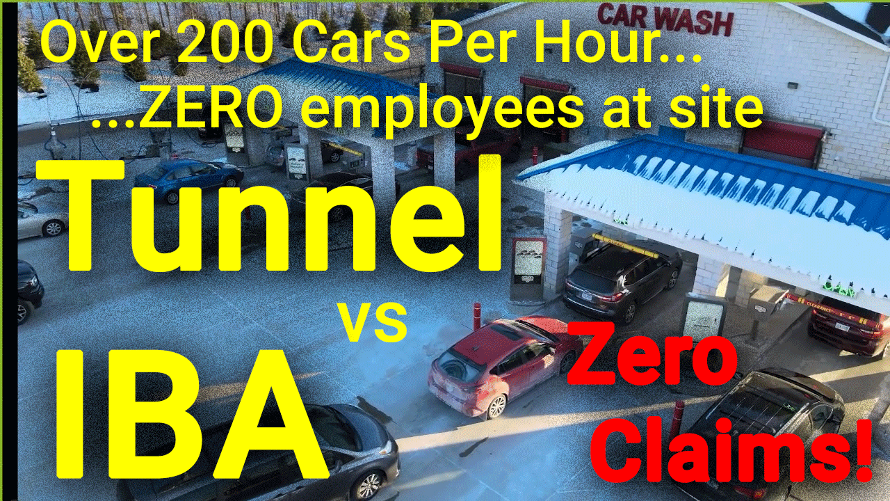
We often hear stories of customers not reading signs. Why do you think that is? Well here are a few reasons and how to help with that.
1. People are moving a 2 Ton vehicle in an inconsistent environment.
Most of us can drive fairly efficiently without much brain power, however, our brain starts to use much more energy when the environment is interrupted or inconsistent. When pulling into a business where it’s stop and go, cars pulling in, cars pulling out, people walking around, etc., our brains are on full alert to not run over anyone first. Granted people may be looking for their wallet or phone as well, but this just adds to more distraction and brain power load.
Because of this, they will not pay much attention to your signage, and when they do look, if it’s any more information than what’s absolutely needed, it will only cause frustration on a subconscious level which adds more stress to brain power, and in turn gives patrons a negative “feeling” of your establishment right of the bat.
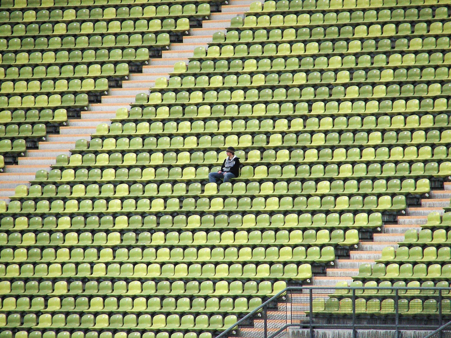
2. Our attention spans are getting measurably shorter due to social media and overstimulation of electronics. Most don’t have time for the details and trying to navigate details will just lead to frustration, same as above.
3. Many businesses have submitted to the urge of trying to “show everything” or “get extra” with every sale. Another factor related to this is also showing signage of every liability possible and how they’re “not responsible IF/FOR.”
I’m not saying there isn’t a use for these at all, but bringing signage to a minimum will lead to less frustration and more sales/Monthly’s. Why? Because people who are less frustrated and confused feel “safer” with the choices they make due to CLARITY. Clarity = happy customer = easier to sell to = more likely to become an advocate for you.
Suggestions:
First of all I’m using the term “Negative Space” not as defined in artistry, but all the space being on location or on signage, flyer, etc. that isn’t giving a message. When you create more “Negative Space” the message you want to convey will usually come across clearer.
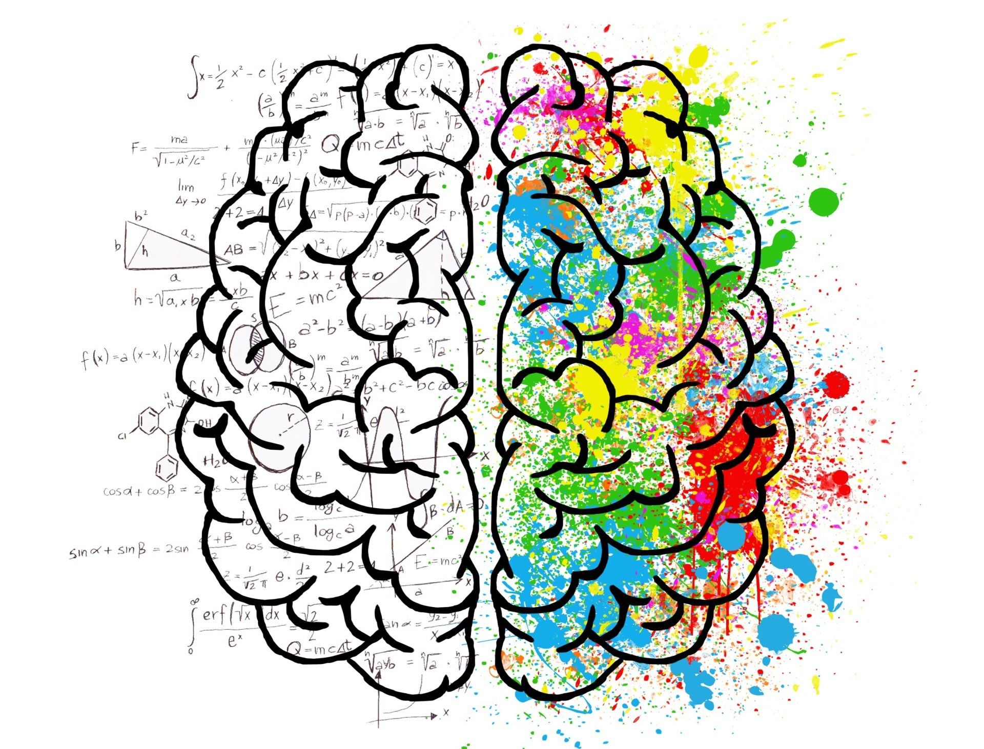
Why? The mind takes in everything, especially the subconscious, which if you’re in any business, the subconscious is what you’re really trying to penetrate as it’s the most powerful part of the brain that triggers decisions (ie: purchasing).
The more blank and negative space you can intentionally create, the more clear the message will be. For example: If your employees are wearing all black, every time, then that is less for the mind to worry about, when they present a flyer, the flyer will stand out. If you have less signage, and the colors of the signage are clear and bright with less wording, the message will be more clear.
If you have employees wear all black, less signage, and the signage with less wording and options, the focus of the whole operation of traffic flow starts to become much easier for the patron.
To reiterate, easier equals lower stress levels, lower stress levels equals less defense mechanism in the mind (stress, fear, defense… all similar), less defense mechanism stimulation equals WAY easier to sell to.
I know I’m just talking about signage here but if you’re keen you can see how the principles behind it can be applied to the rest of your business or wash.
Conclusion Cliff Notes: Use as few options, words, sentences as possible with signage outside the tunnel. The less you use, the more people will actually read what you DO have.
The goal is to “Present.”